
Magazine Design
Creative
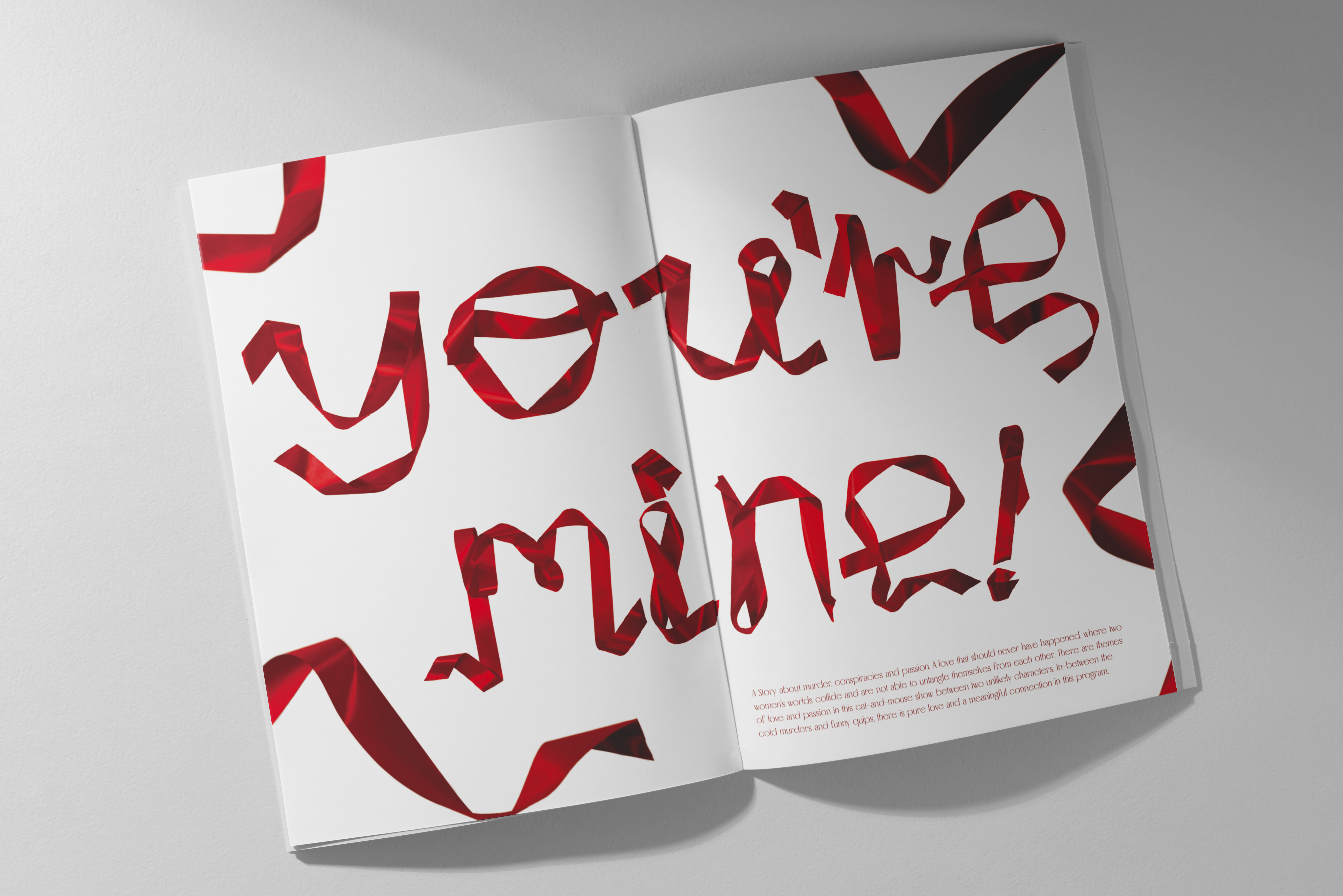
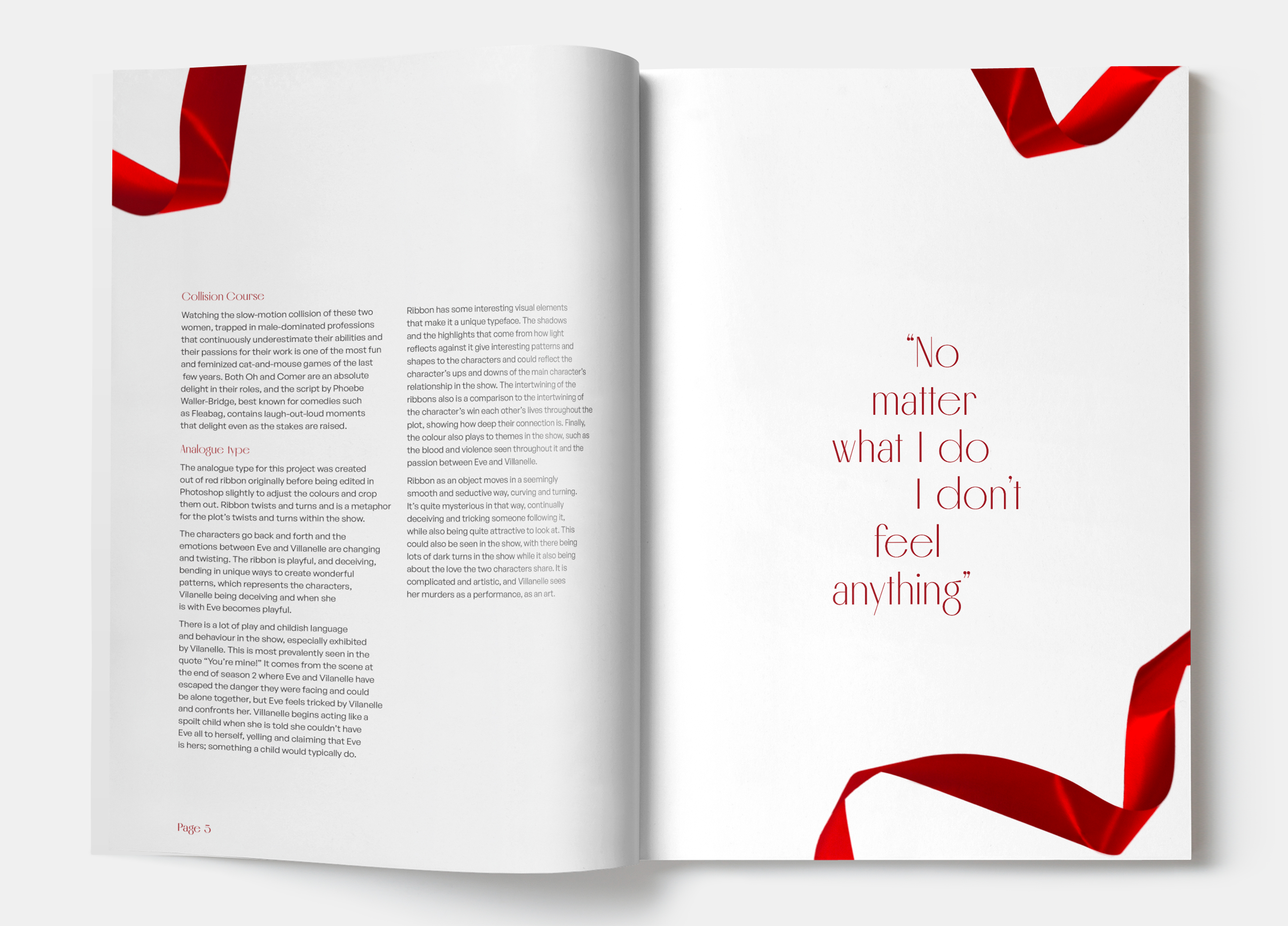
The hero of the design, the analogue type, is created out of ribbon to best express the style of the show, Killing Eve. Visually, the colour red and ribbons are already used as key themes within the show.
Ribbons create a twisting, mesmerising path, and the
way it curves and flows through a scene is quite
seductive.
The layout guides the reader around the page using
the ribbon and white space. By using blank space
around the design the text is the main focus of the
page, and brings attention to the analogue type.
Socials
↗ LinkedIn ↗ InstagramContact
↘ Hello@JacobBryant.DesignMade with love & coffee☕︎
This website has been carefully designed and developed by myself
from scratch. (Find out more
here). All work is my own
unless stated otherwise. Thank's for stopping by :D

