Branding
Motion
Social Media
Out-of-home
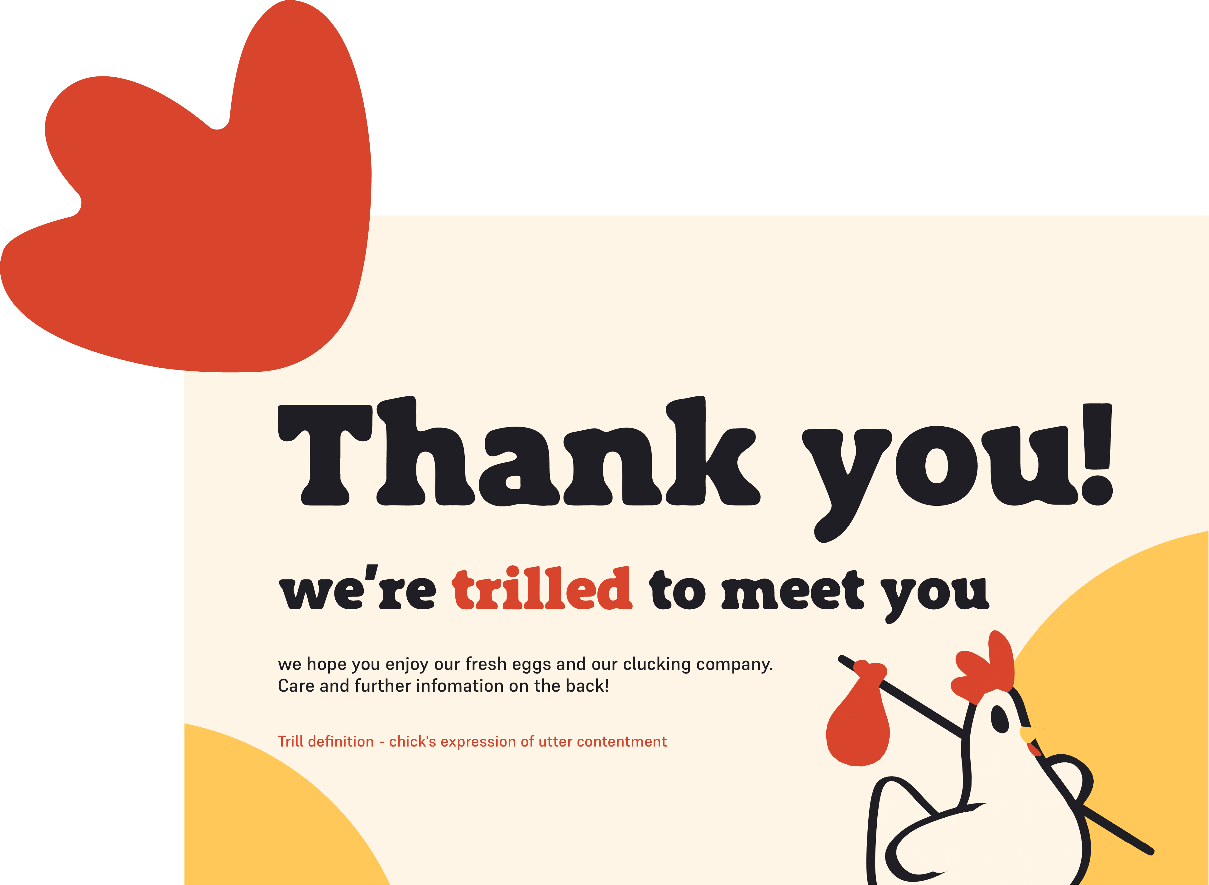
The chicken rental brand fighting for the fair treatment of chickens.
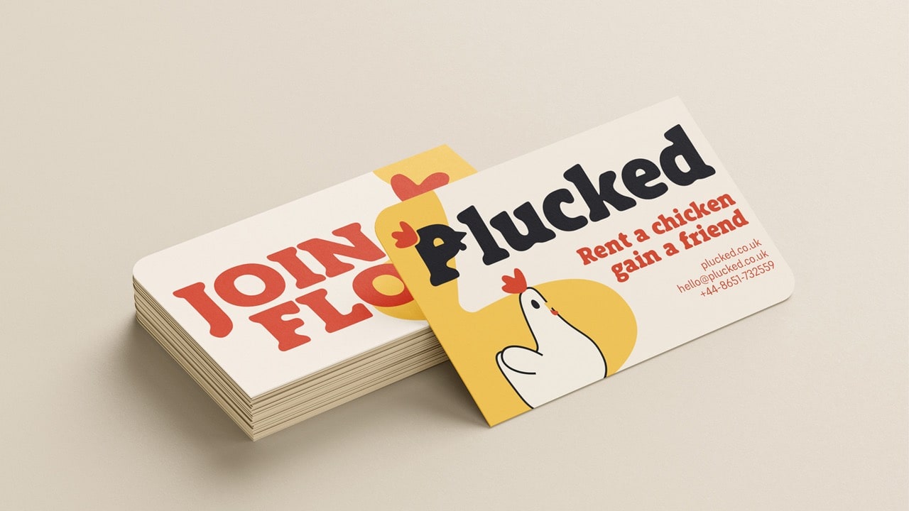
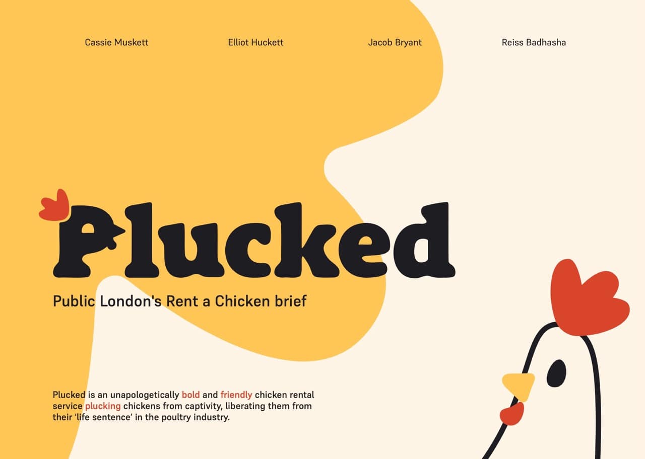
Starting with the brand assets for plucked.
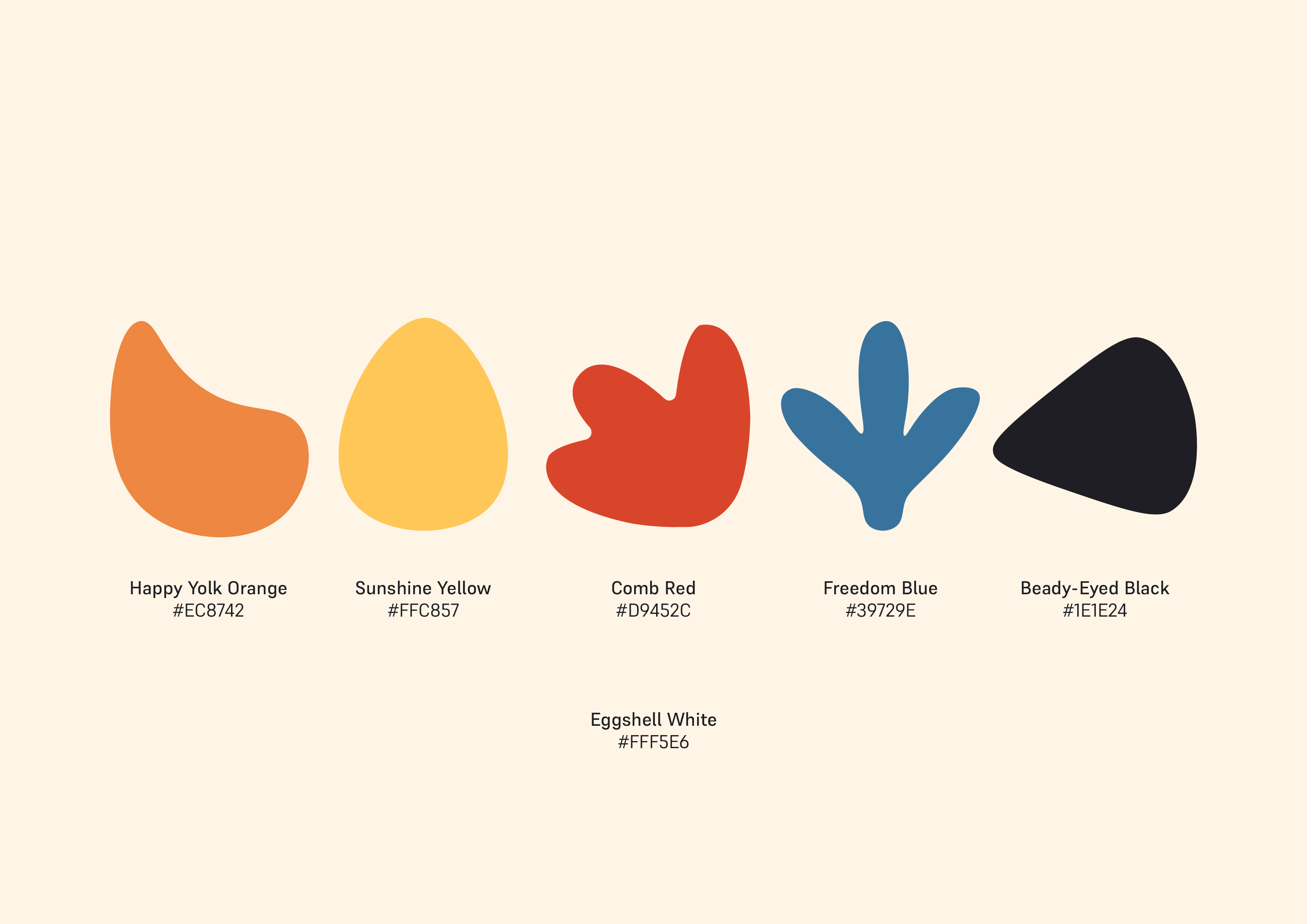
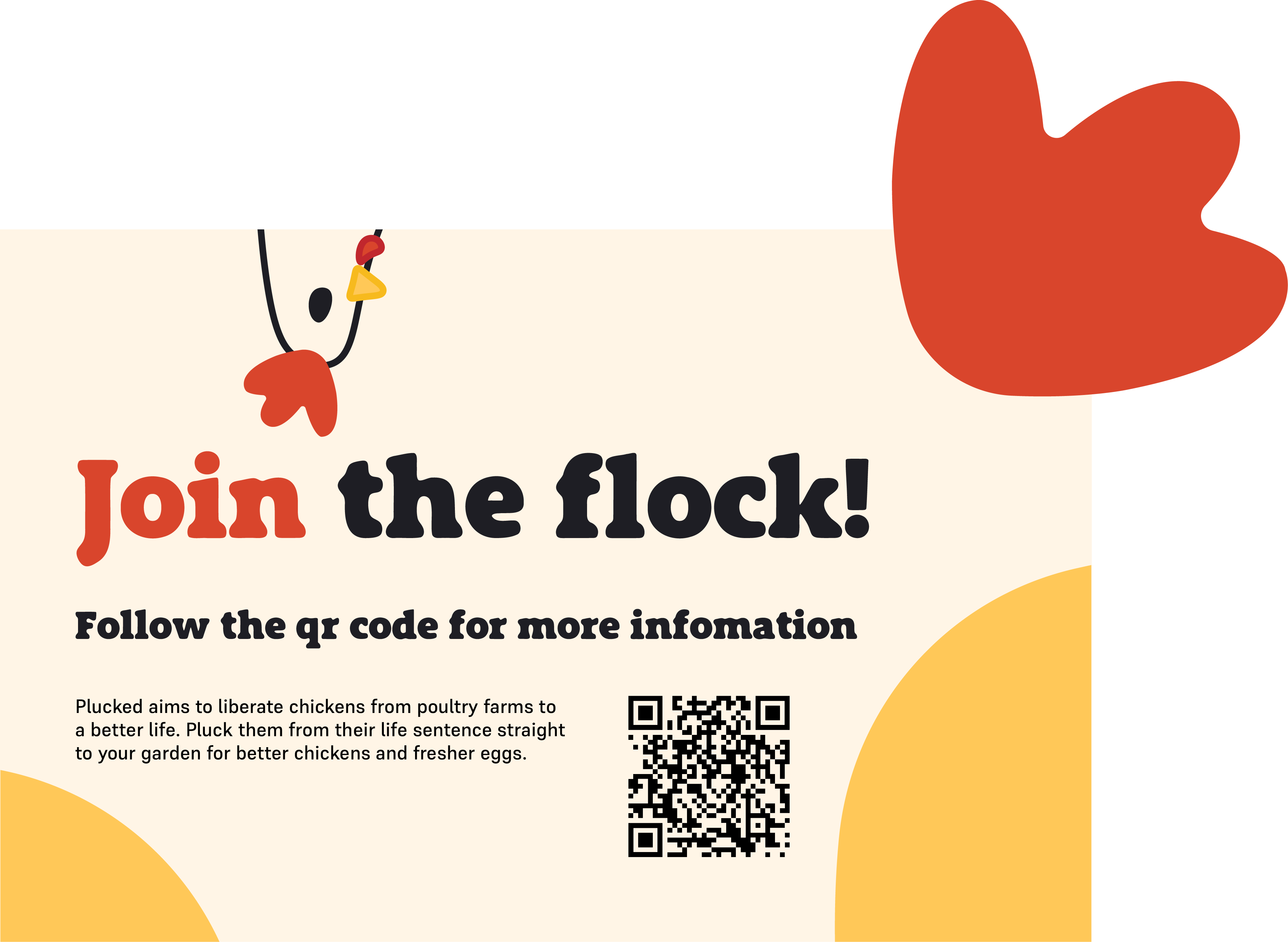
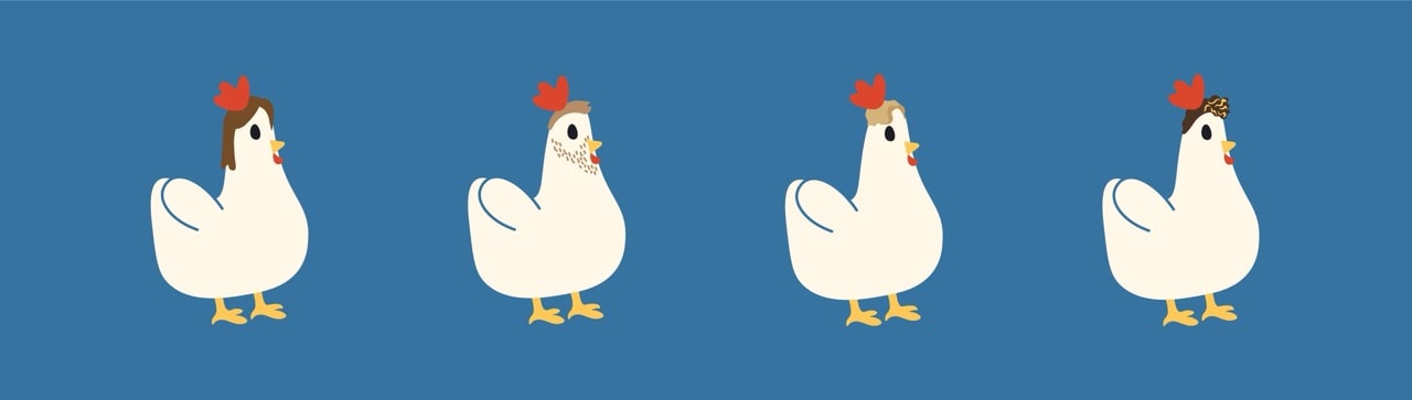
When designing, we took inspiration from real chickens to create the brand elements for Plucked. The brand uses playful cartoon shapes designed from parts of a chicken, while the colours reflect the natural colours of chickens.
We created a custom, working typeface. Starting with a bold impactful typeface, but plucking the corners of each letter to create a playful but impactful typeface. "Plucking" became the primary part of our design language.
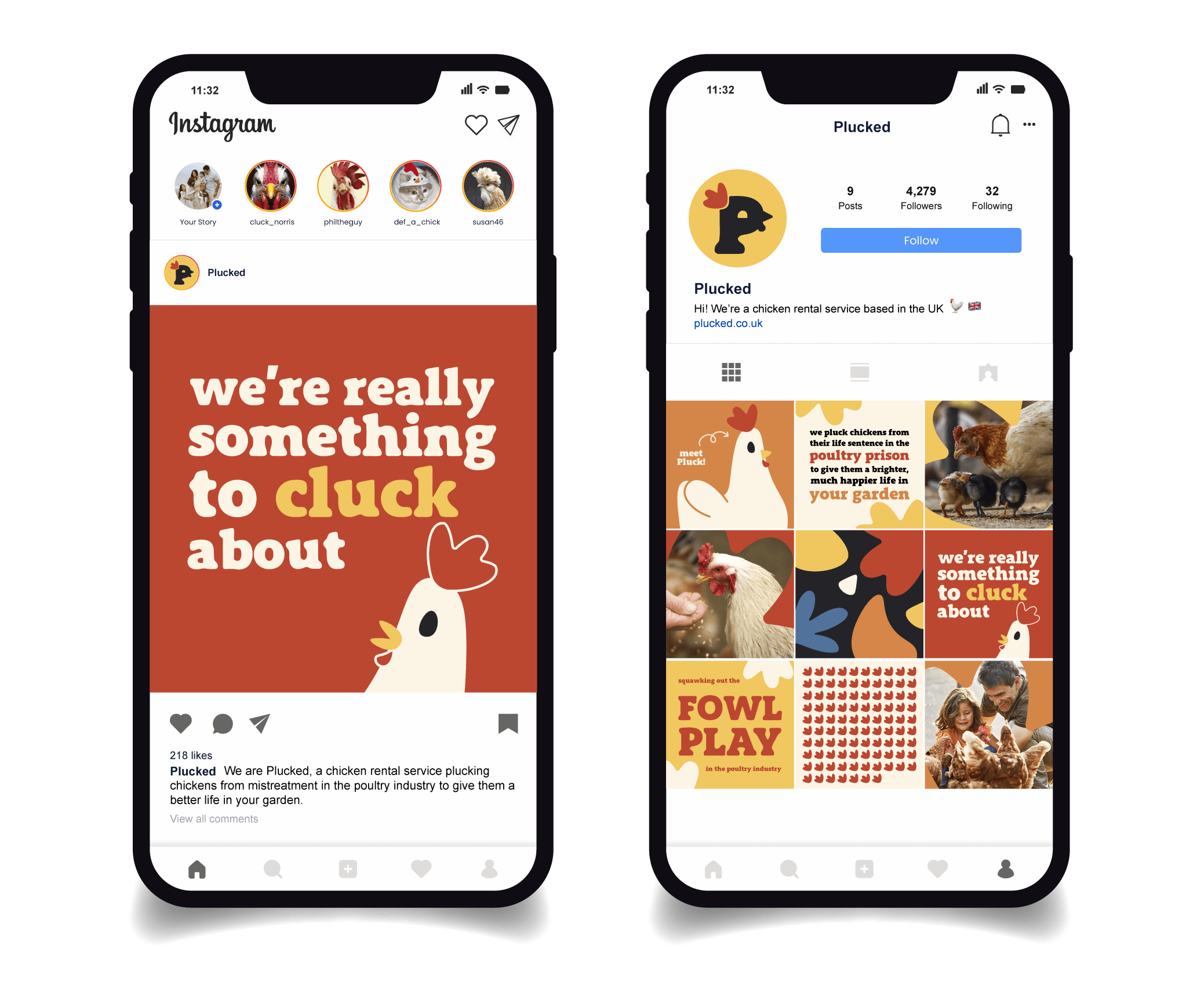
The social media content we created for the brand.
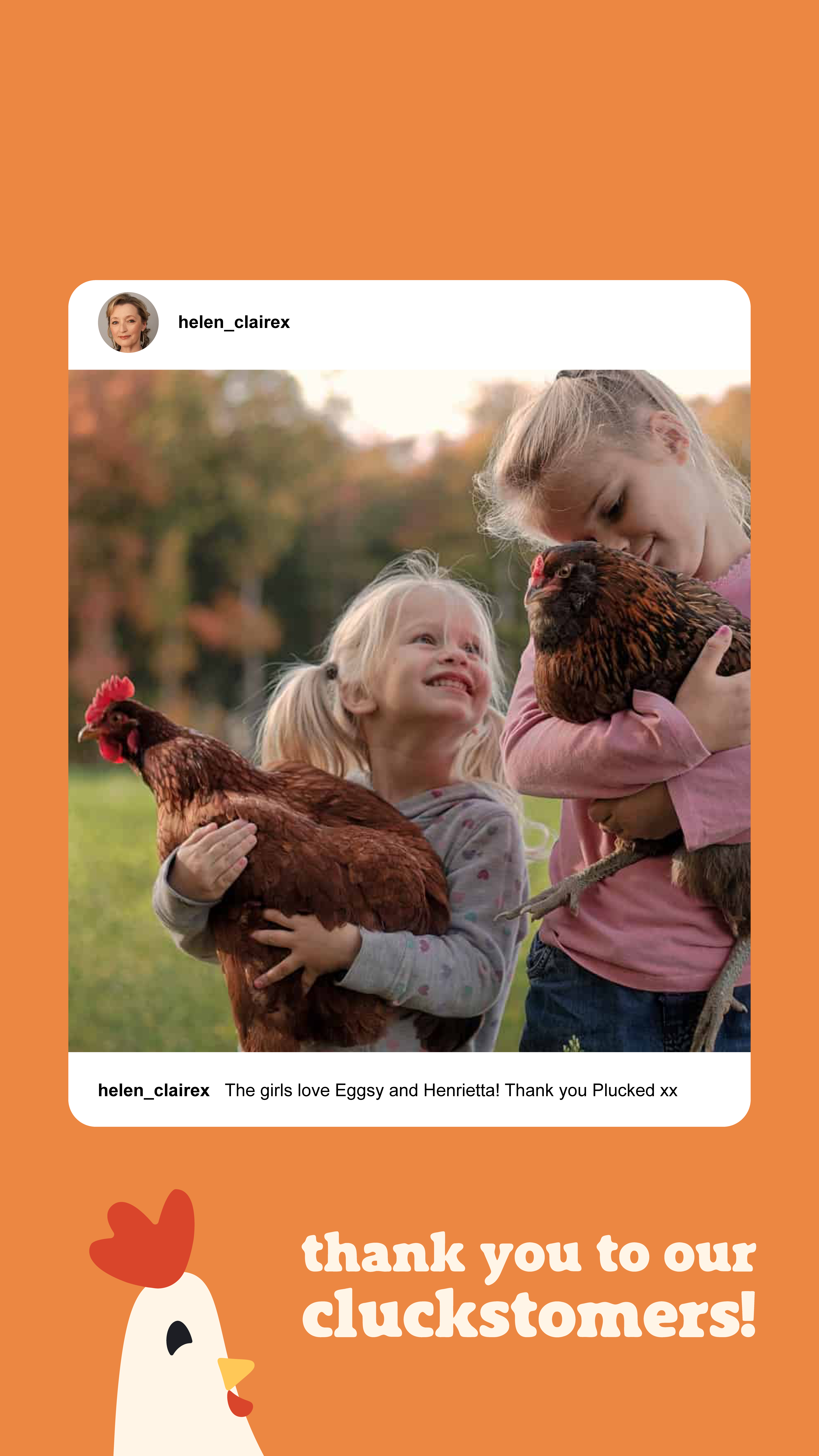
Instagram became our main way to interact with a younger, family-centred audience, simultaneously allowing the brand to raise awareness for the mistreatment of chickens.
We created stories and instagram posts that communicated our brand's energy, purpose and mission, alongside digestable infographics about the horrific facts we discovered about the poultry industry.
How the brand looks in the real world.
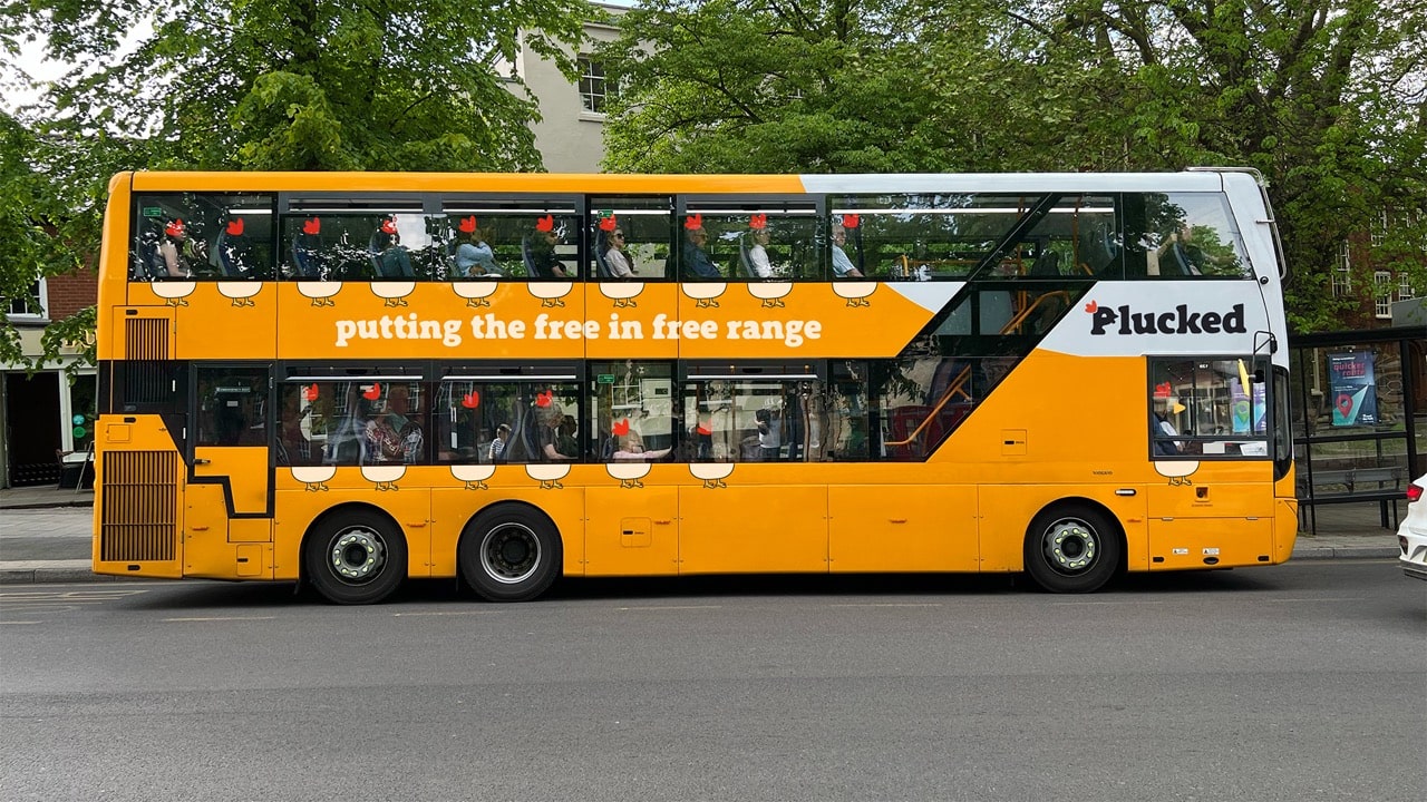
We created various out-of-home advertisements that we were sure would get people clucking.
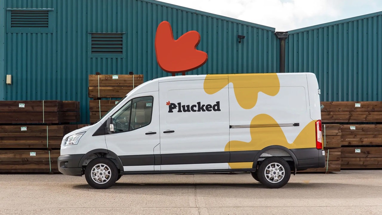
We also considered what may arrive with your chicken — contact cards, thank you letters, and even the vehicle it may be delivered in.
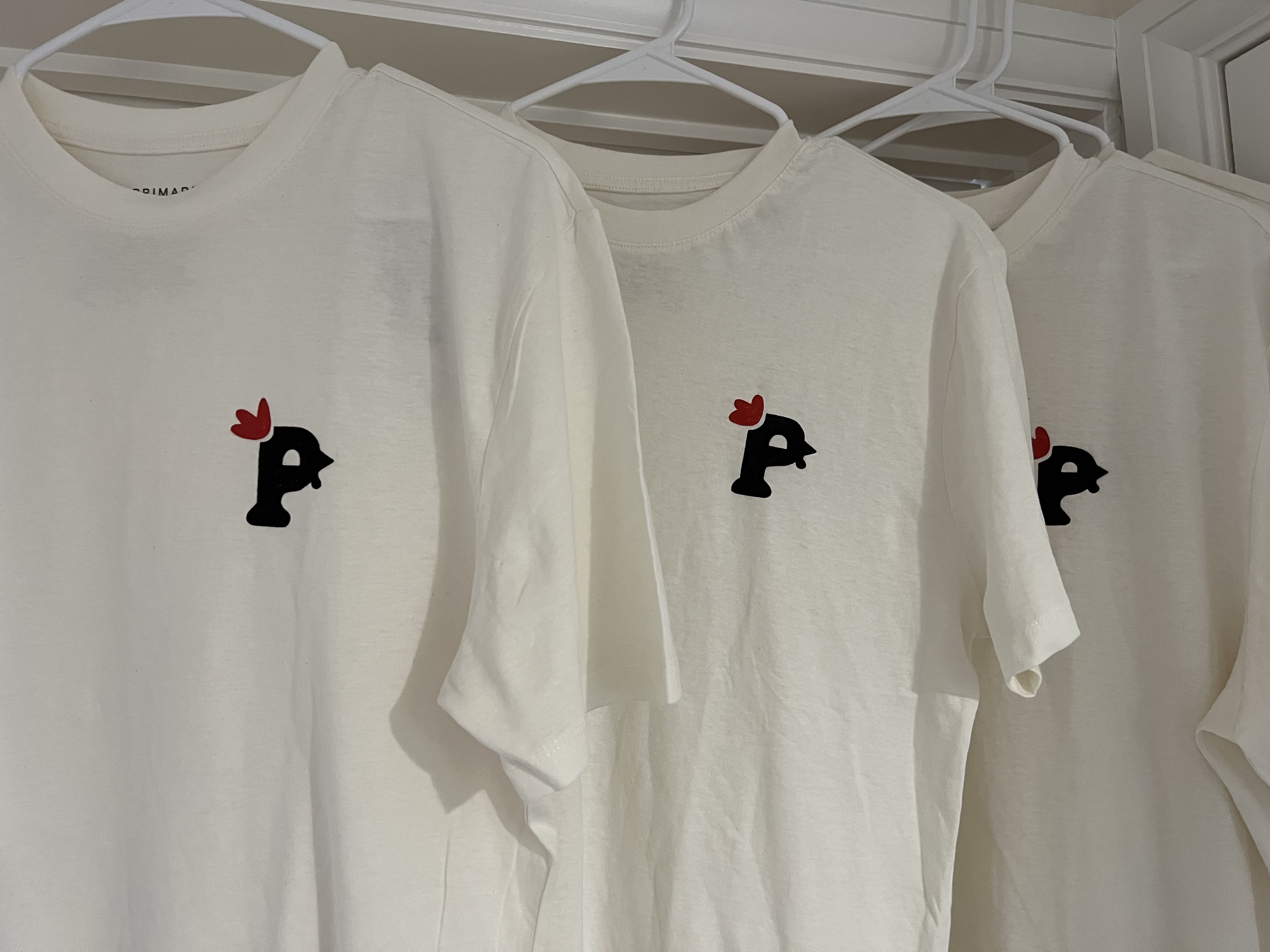
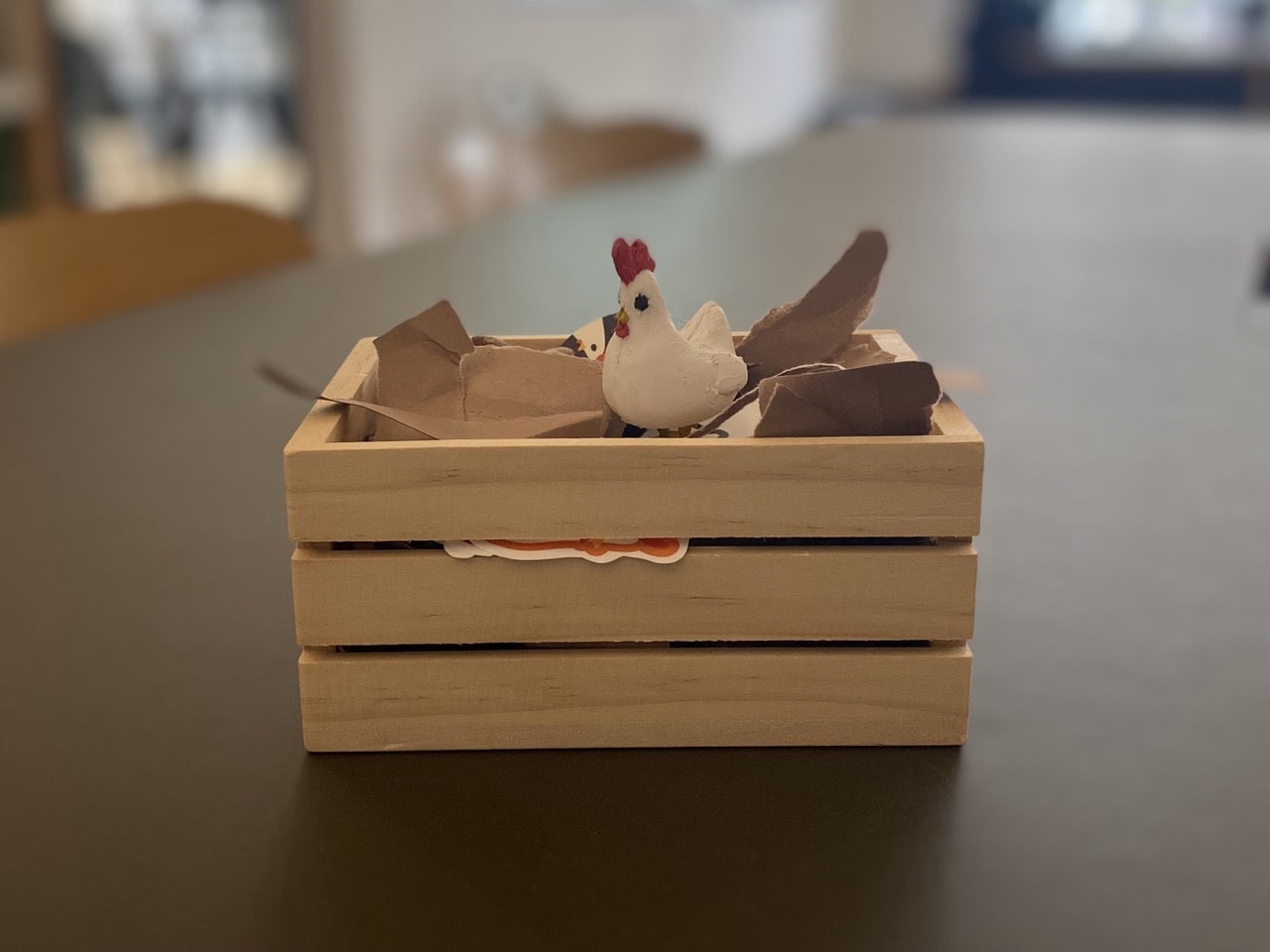
This included custom T-shirts, a 3D printed chicken as a gift, and a presentation that left them without any feedback to give us.
What we showed Public London when we presented.
When presenting this work, we had to put all our confidence and energy into unveiling the brand. Have a look at what we presented by clicking the image.
The plucked team as chickens.
Site
↗ Work ↗ Life ↗ Info ↗ ChatSocials
→ LinkedIn → InstagramContact
↘ Hello@JacobBryant.DesignMade with love & coffee☕︎
This website has been carefully designed and developed by myself
from scratch. (Find out more
here). All work is my own
unless stated otherwise. Thank's for stopping by :D