Creative Direction
Branding
Logo Design
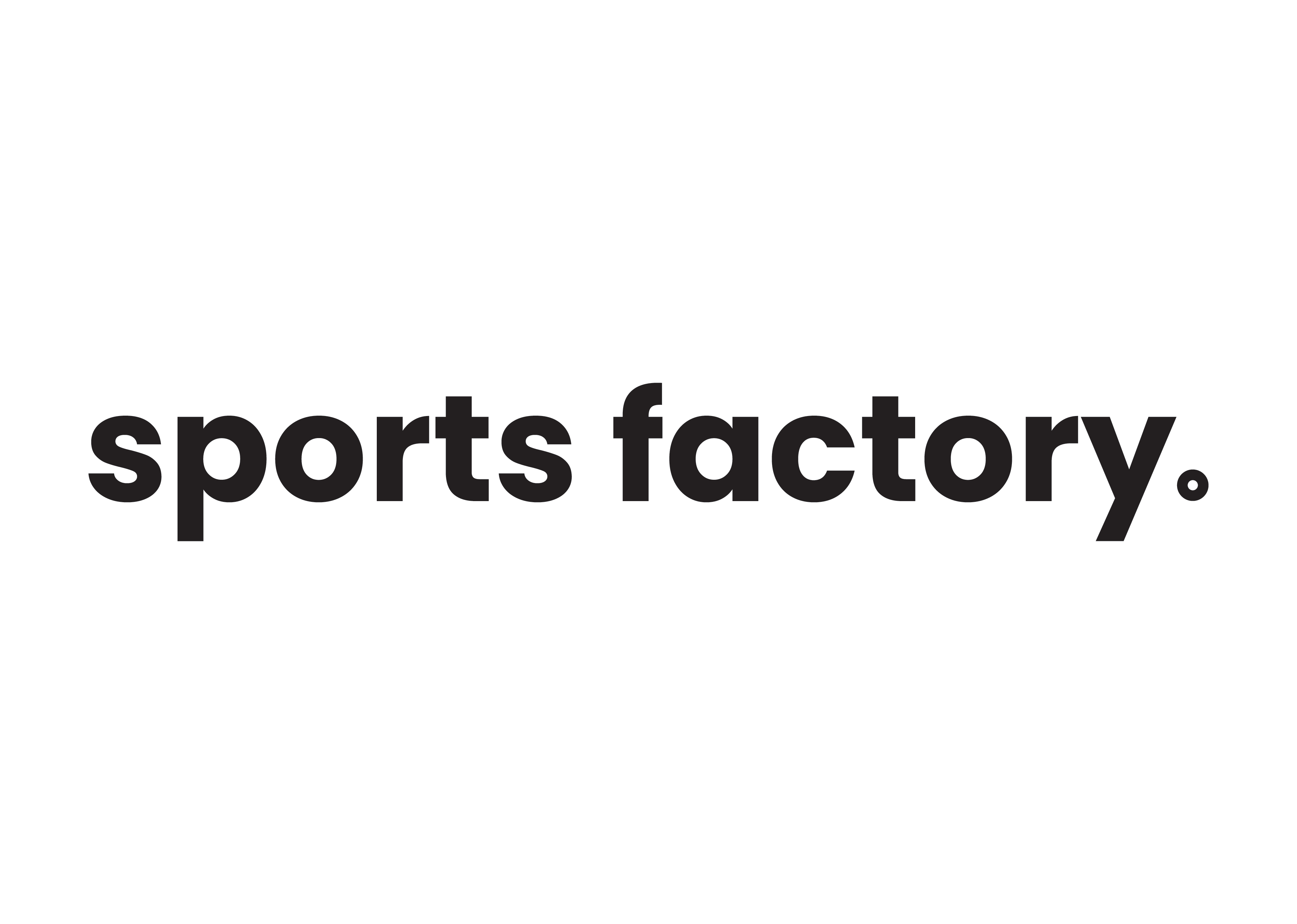
How did Sports Factory come to look the way it does?
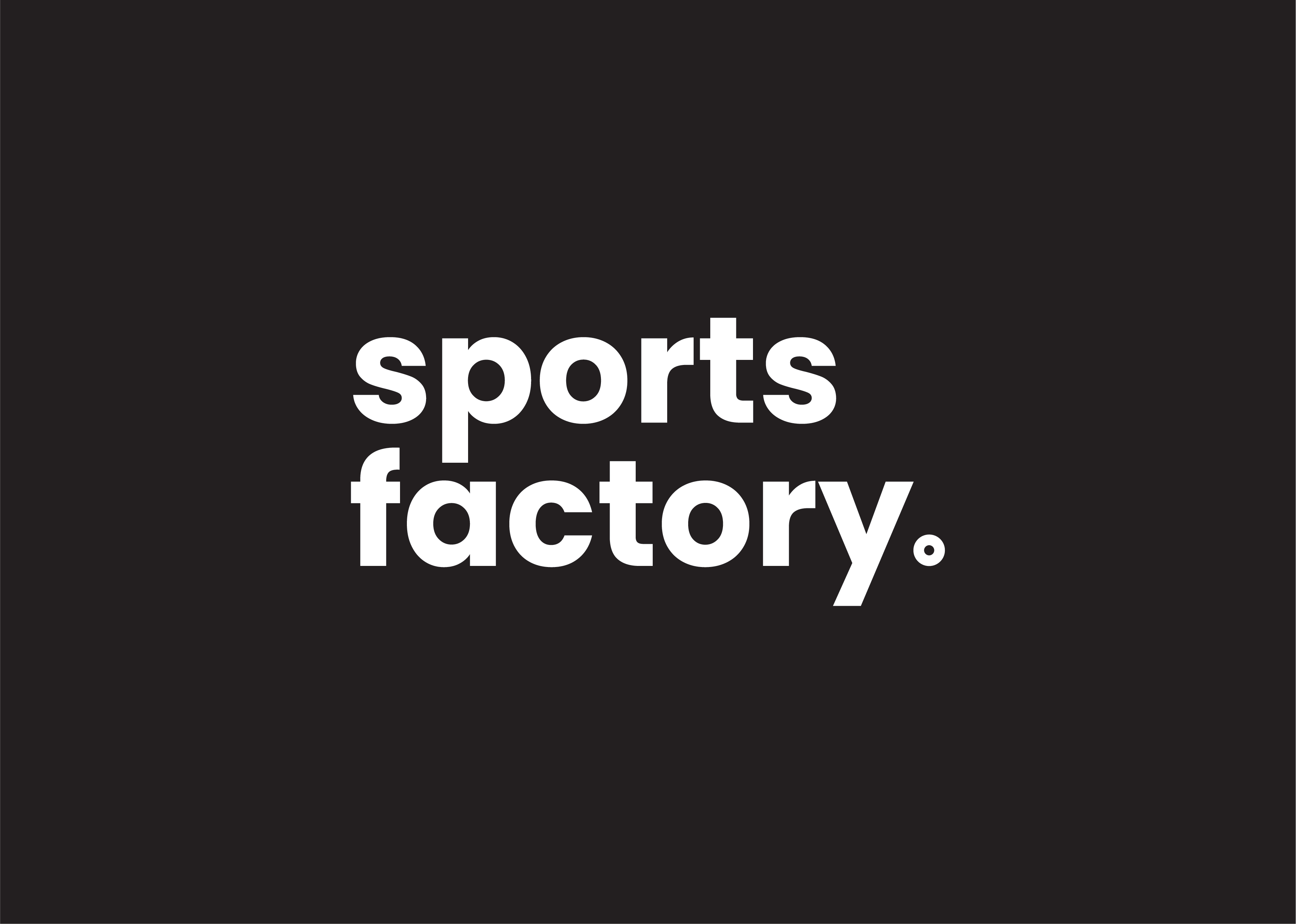
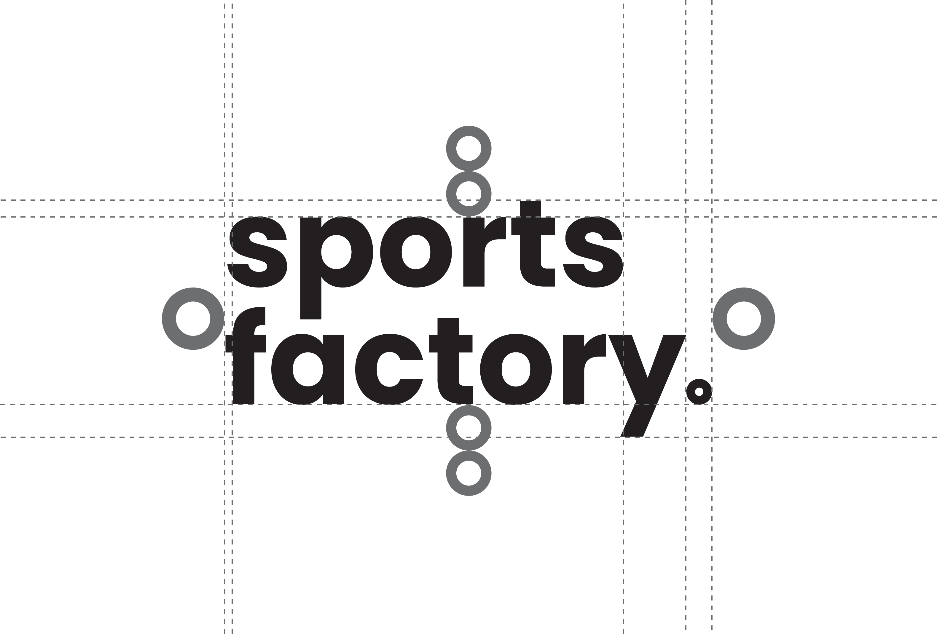
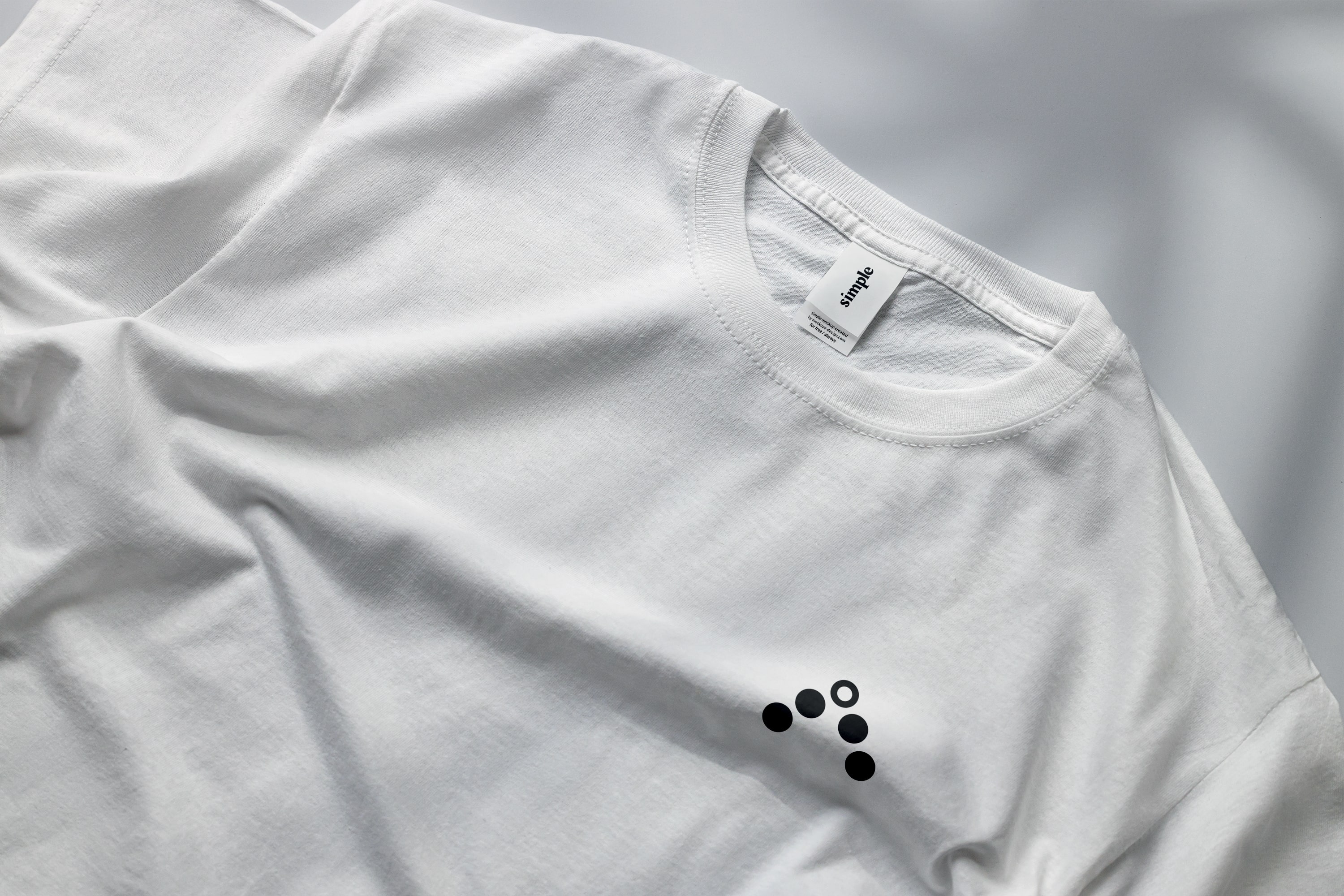
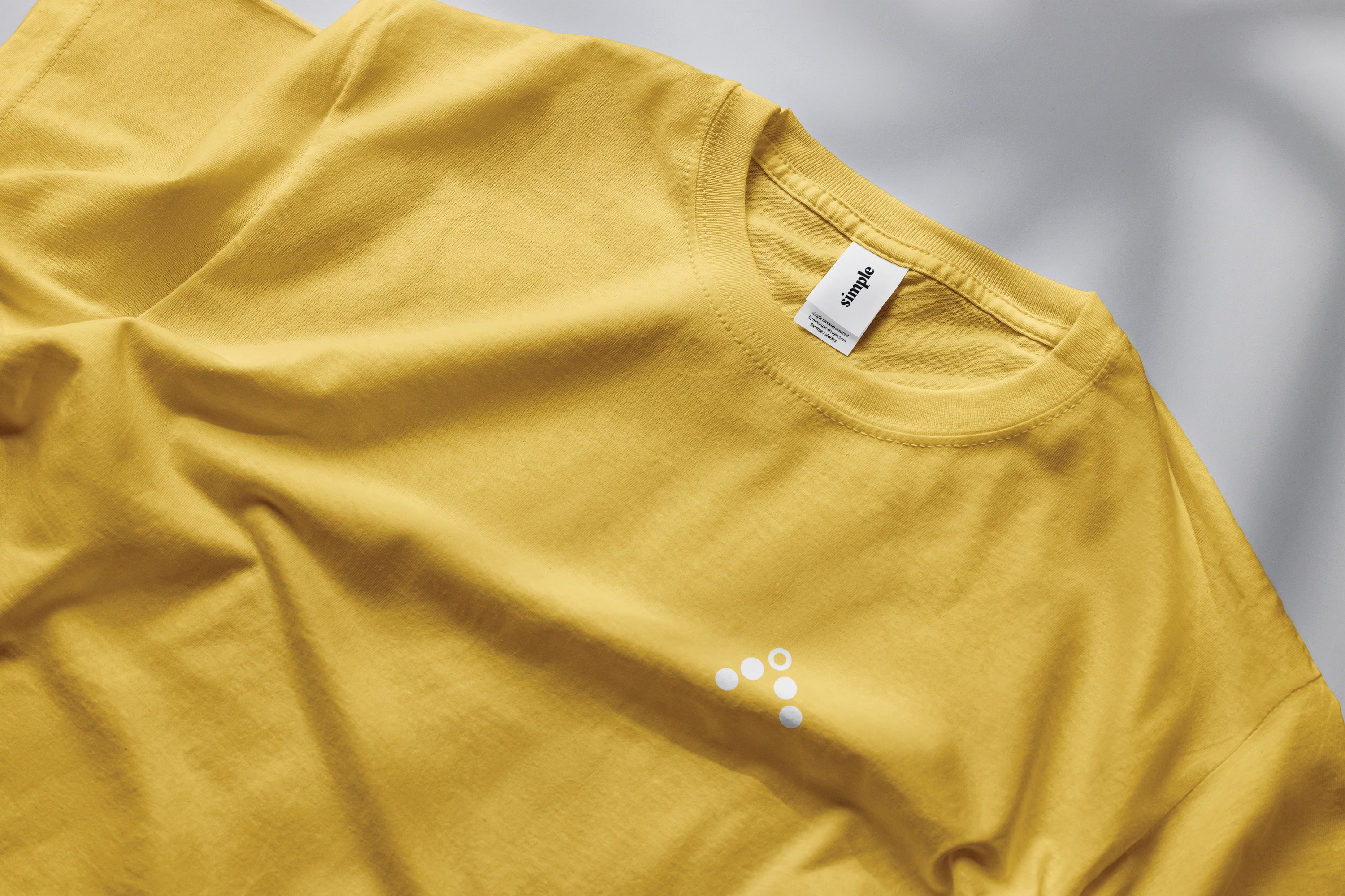
This rebrand required a minimalistic black and white
identity that would stand out among brands with similar
missions. The logomark has subtle meanings to both sport
and religion, indicating the two primary goals of the
charity.
What excited me the most about this project was that it
was my first time working with a client outside of uni.

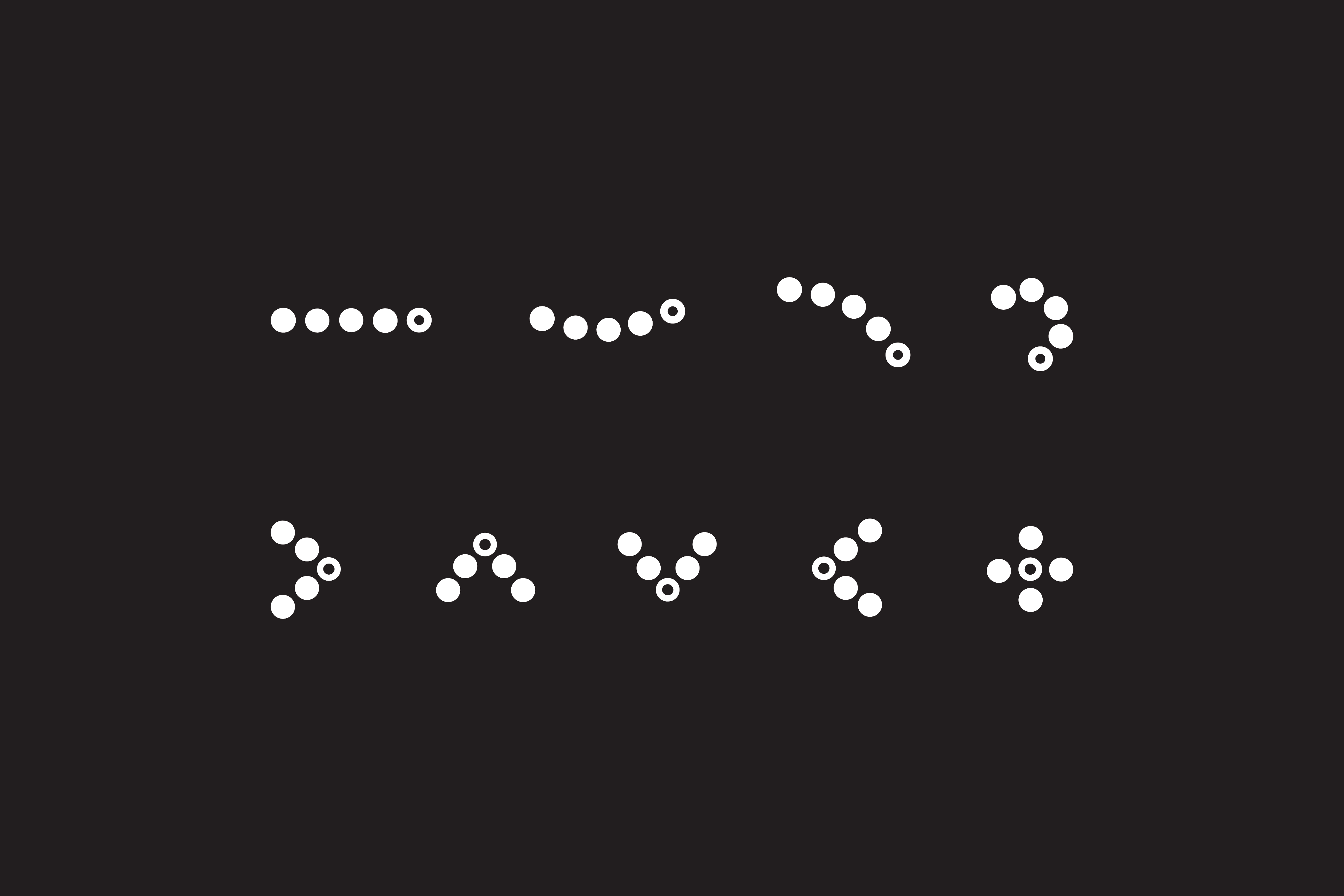
Making the brand feel more alive and providing various applications using the dot system.
Website mockups using the circle as a framing device and the minimalist black and white colour scheme.
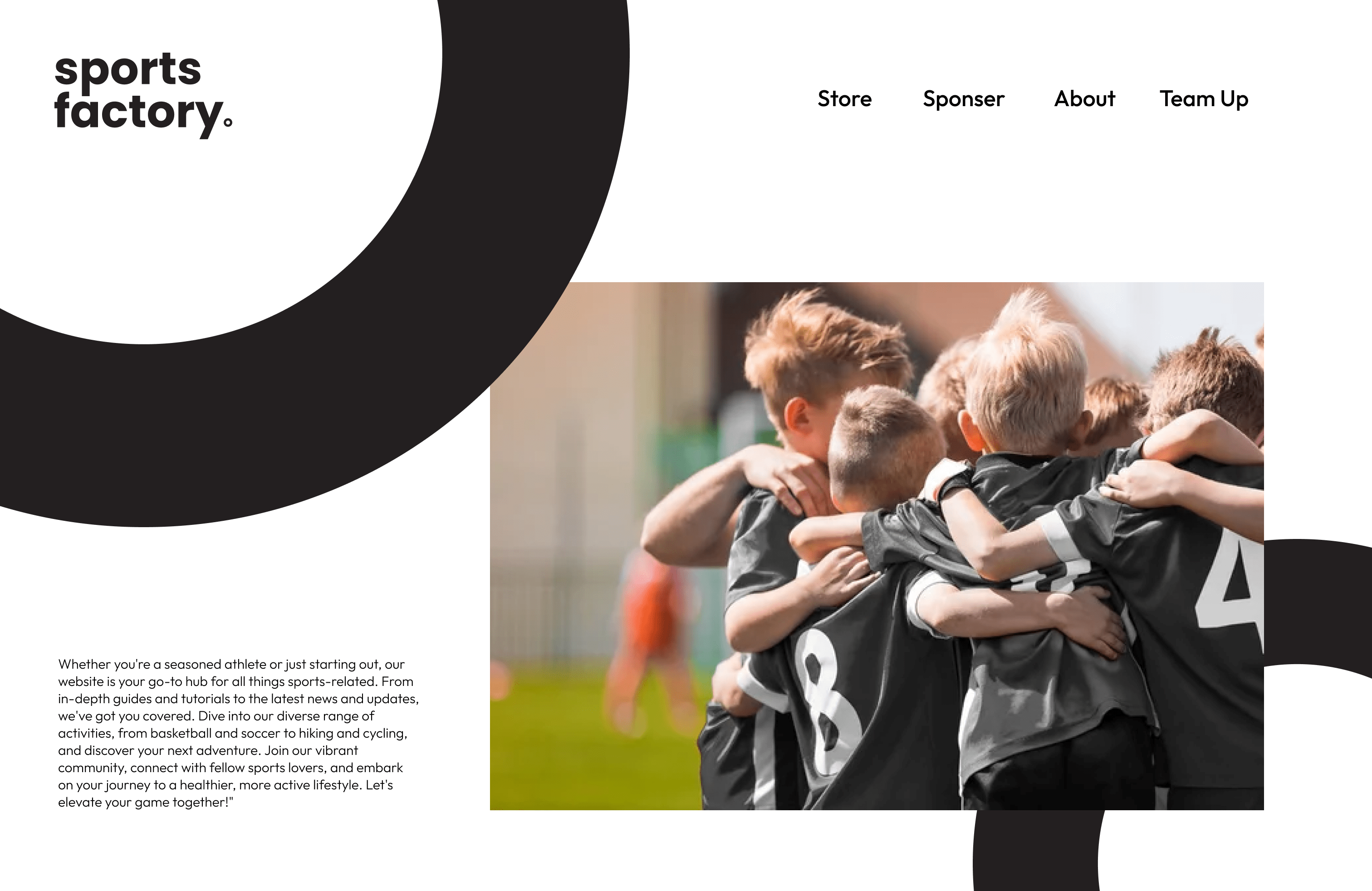
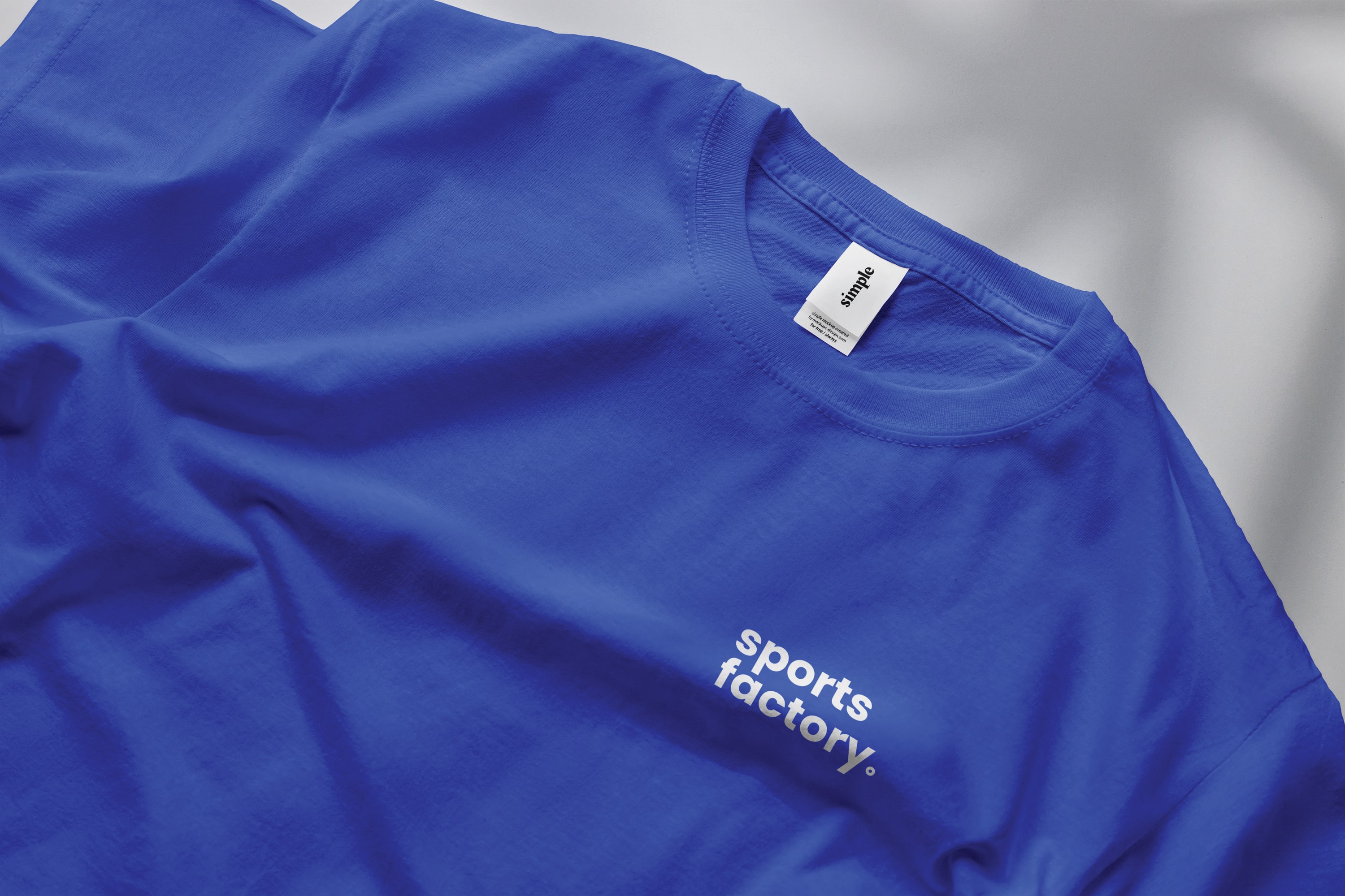
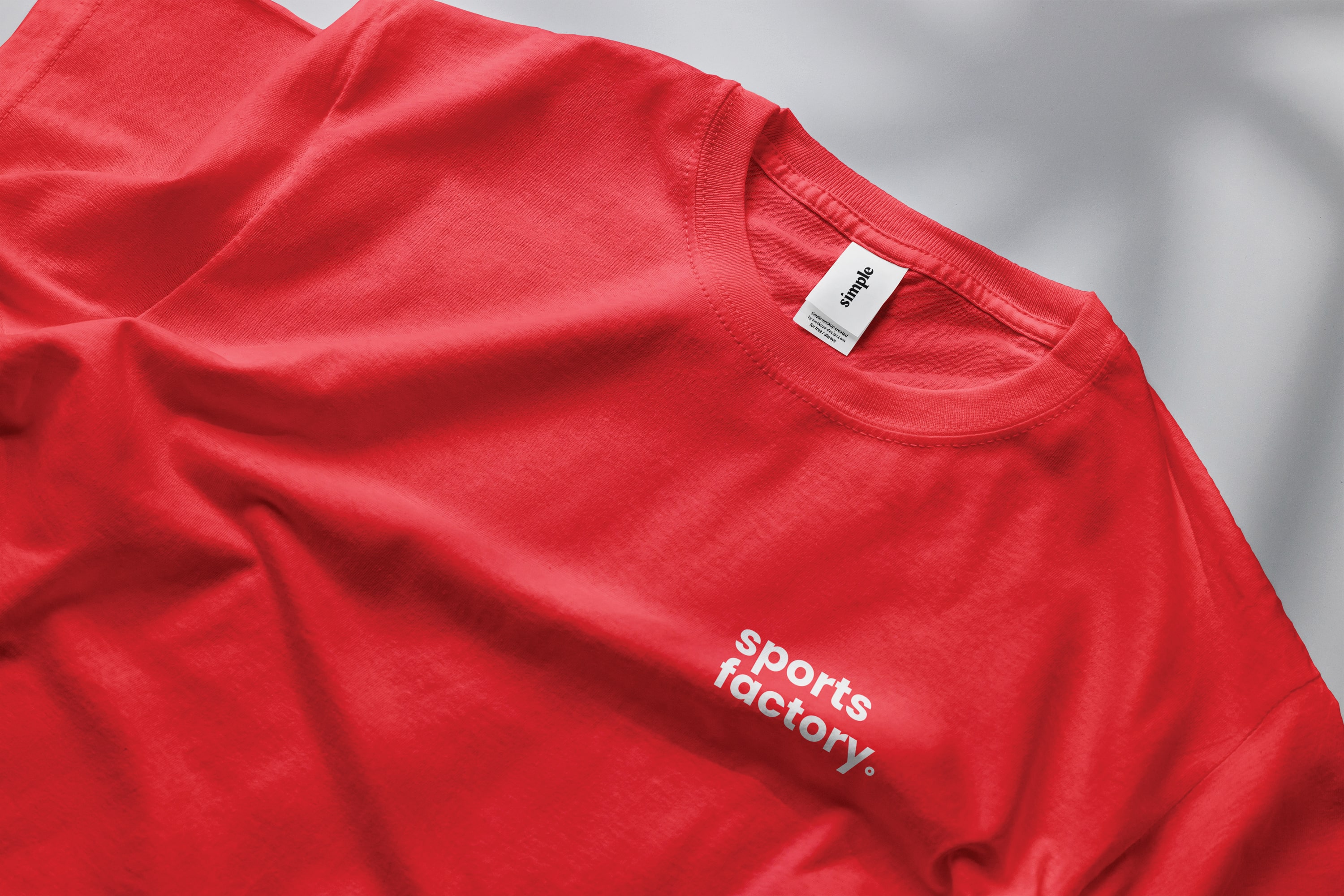
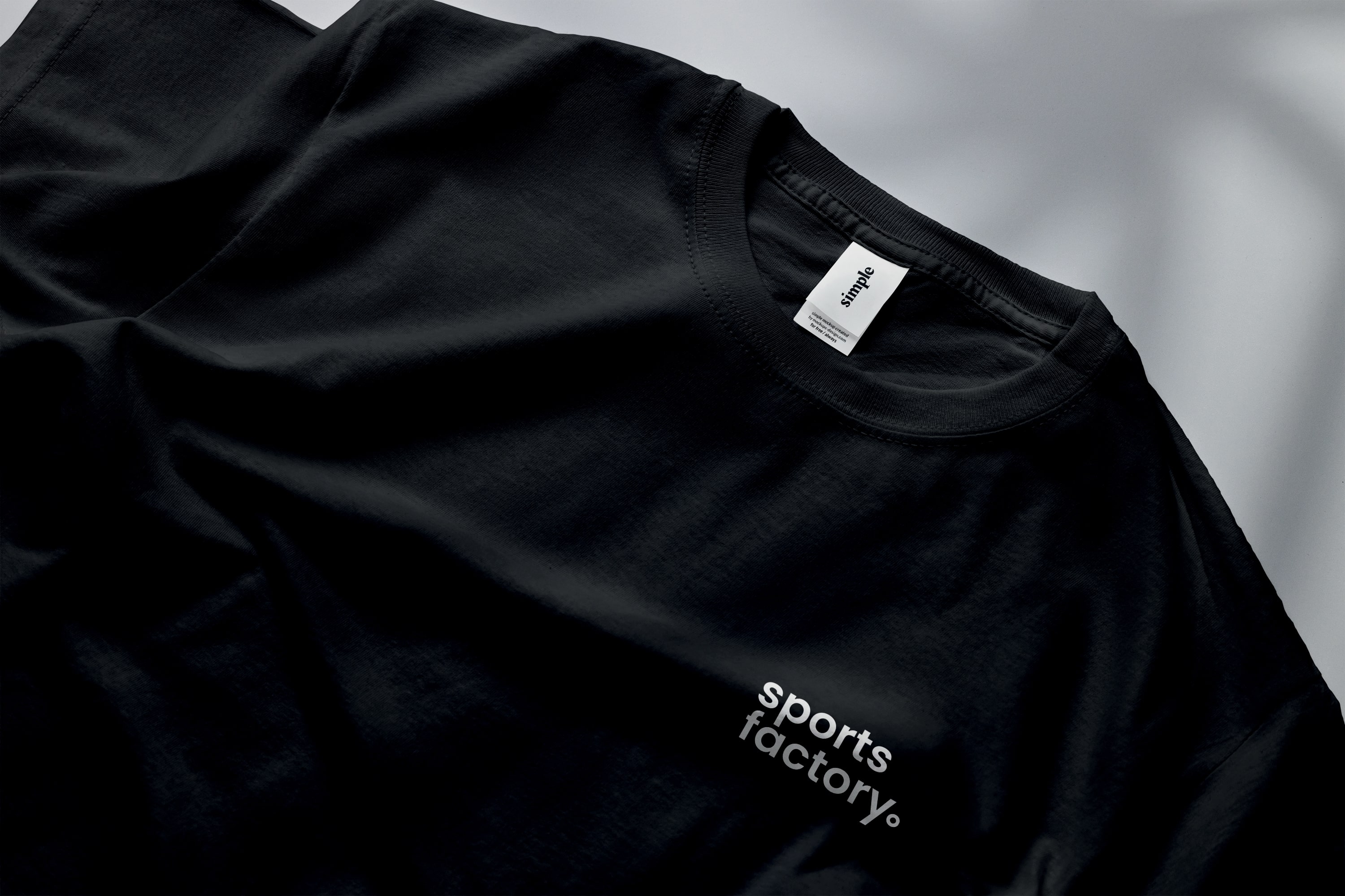
Sports Factory needs to work across various school and team colours.

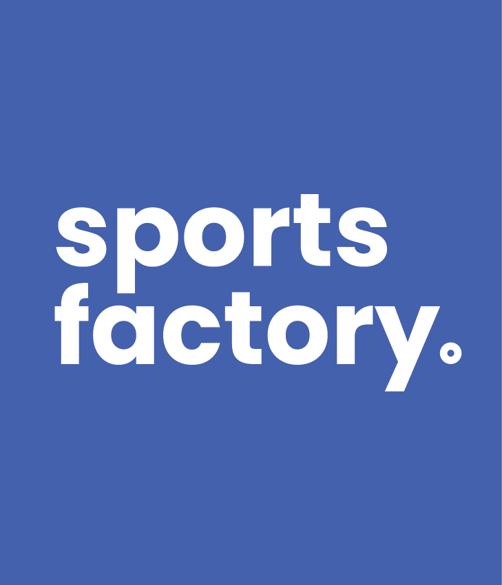

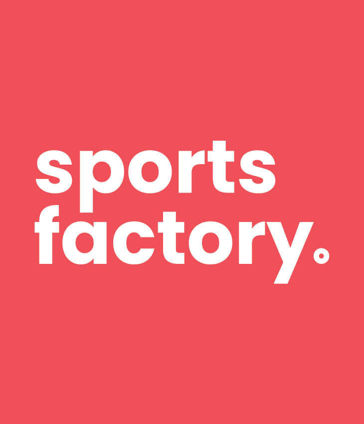

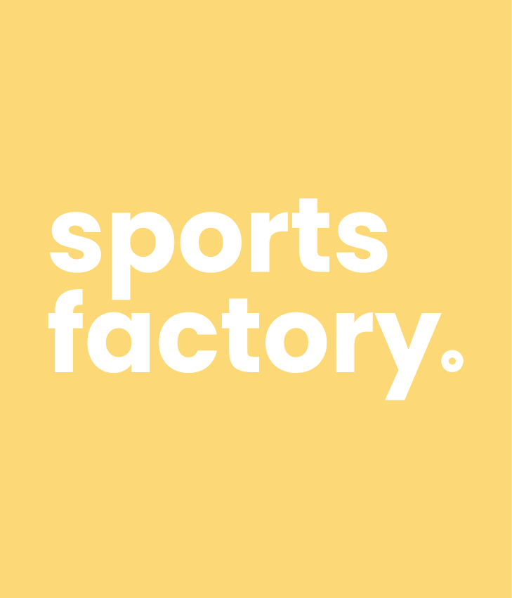
The brand identity system needed to work with a variety of colours, as this brand could appear on various school gym kits. Our minimalist black and white approach worked best for any situation this brand might encounter in the future.
What we presented to the client.
We presented this work to our client, who loved our route and adopted it after a round of revisions. Click the image to view the presentation PDF in a new tab.
Site
↗ Work ↗ Life ↗ Info ↗ ChatSocials
→ LinkedIn → InstagramContact
↘ Hello@JacobBryant.DesignMade with love & coffee☕︎
This website has been carefully designed and developed by myself
from scratch. (Find out more
here). All work is my own
unless stated otherwise. Thank's for stopping by :D